
Spark coffee
DESIGNER: zhangtao
YEAR: 2022
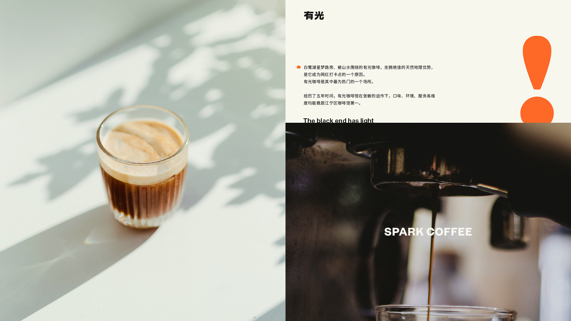
白鹭湖星梦路旁、被山水围绕的有光咖啡,有着很好的地理环境,通过主理人多年的经营,有光咖啡成为了该地区的热门场所之一,同时长期被评为江宁区咖啡馆第一名。
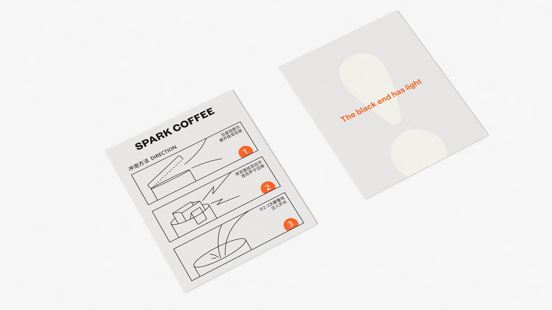
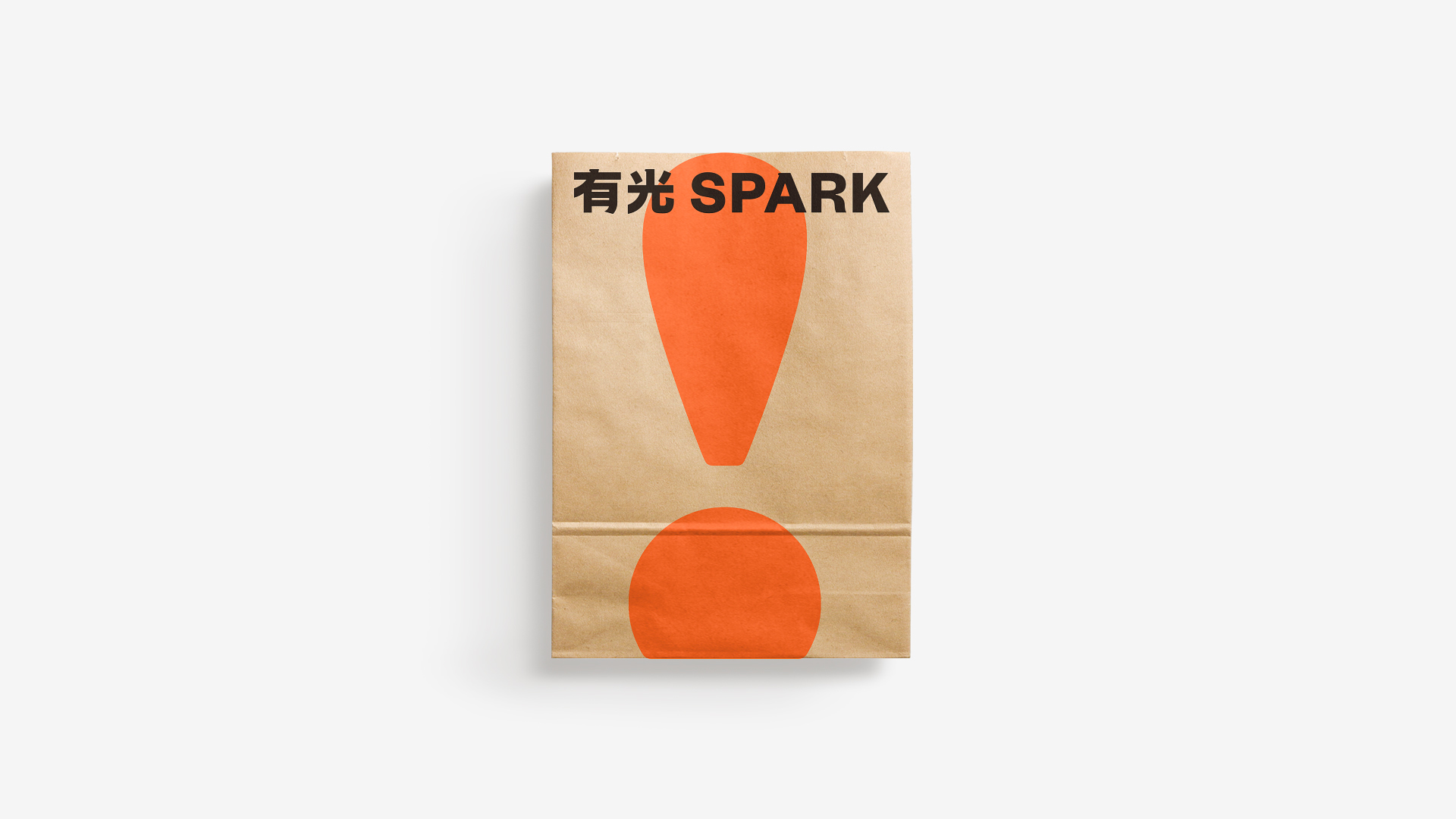
感叹号“!”,是我对有光 SPARK 的理解,这是一个很有力量的符号,经过了多次的细节比例调整,呈现出一个亲和醒目且带有日出意向的样子,搭配了富有感染力的橙色系;呈现光的另一种意向,也反映着有光咖啡主理人–张敏,从清晨开始借由一杯咖啡带给人们希望与陪伴。
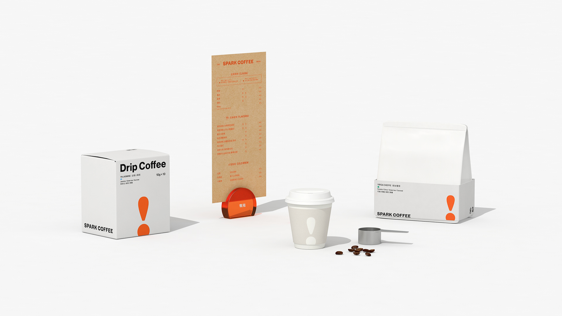
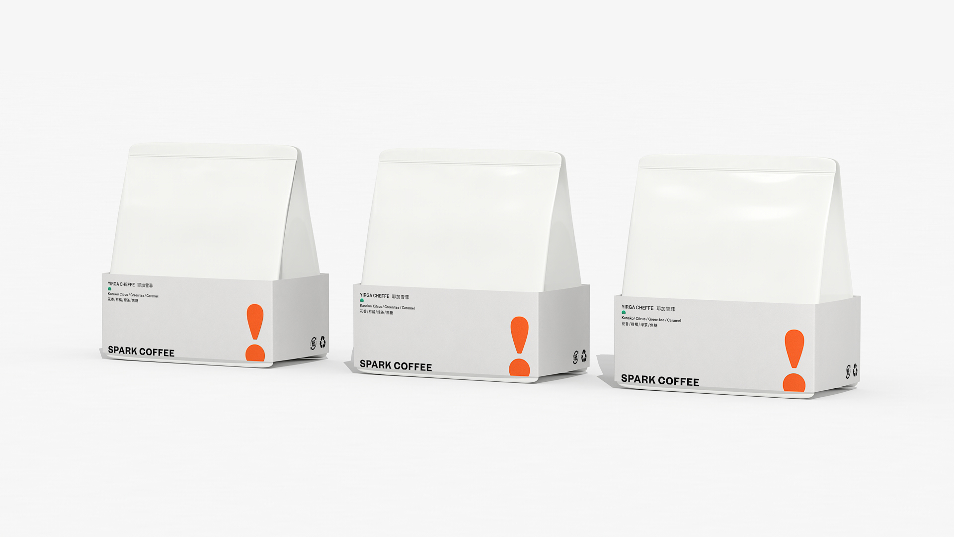
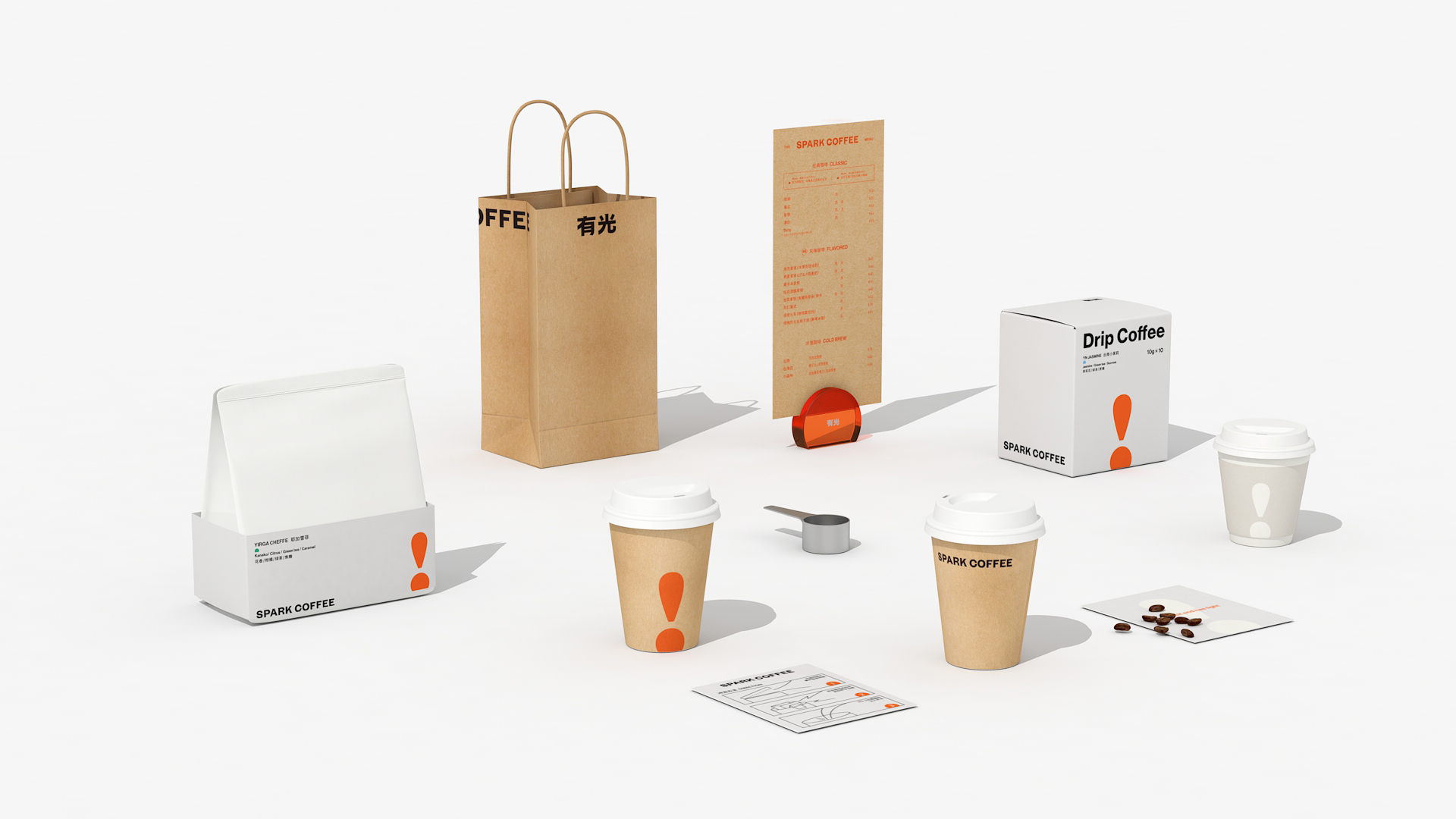
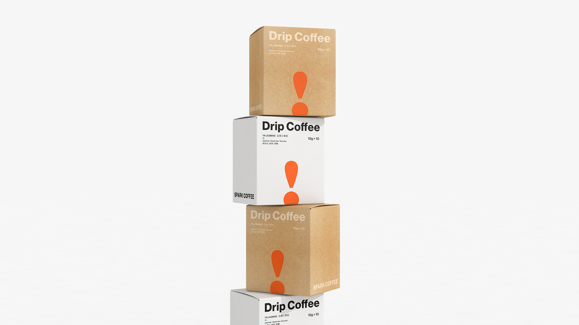
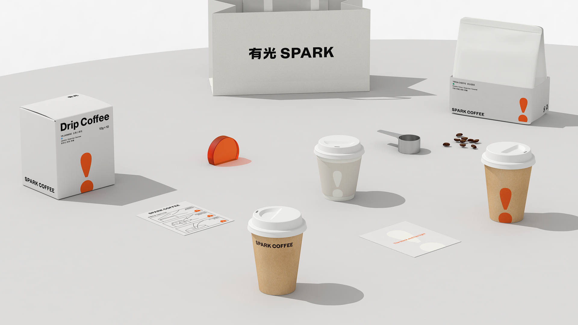
延伸以 “ ! ” 主标识为主,正如咖啡因一样让人醒目提神,给周围的人带来活力。
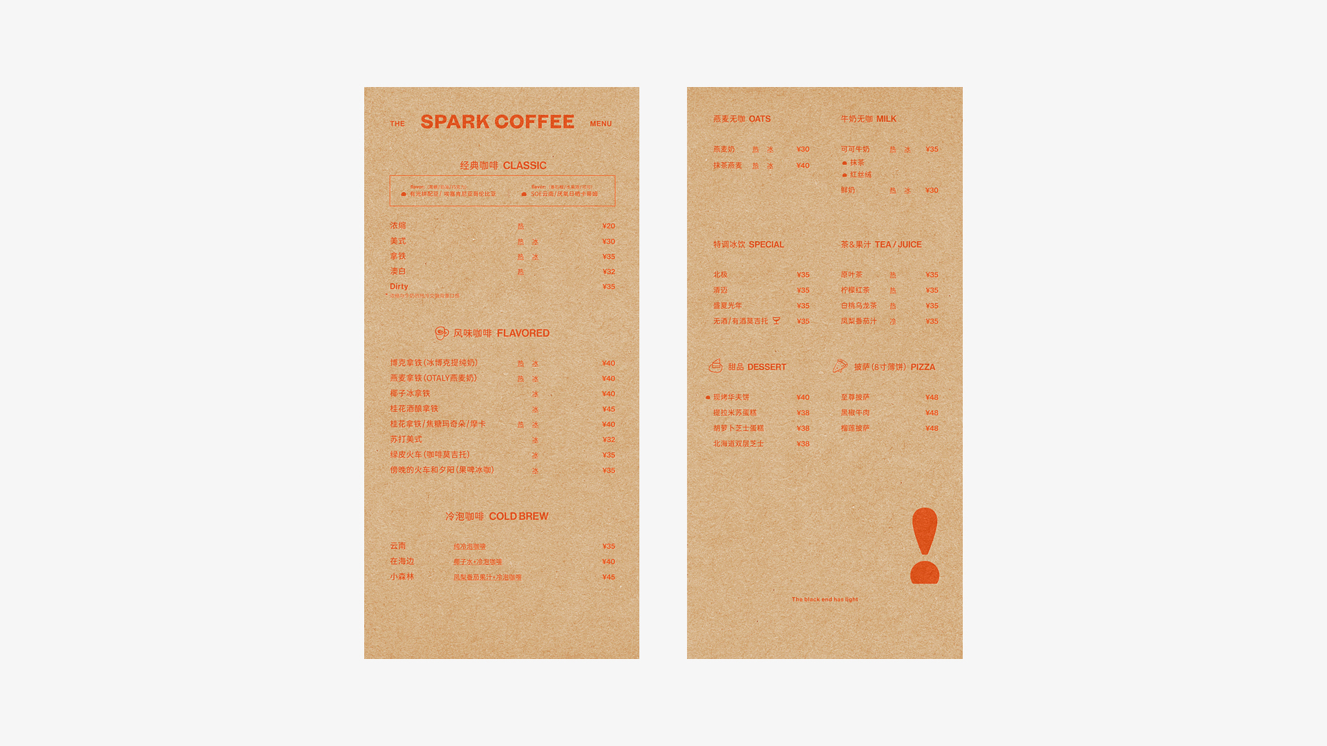
排版上的信息以醒目、直观的形式来展现品牌的亲和力。
Spark coffee, beside Xingmeng road of Bailu lake and surrounded by mountains and rivers, has a good geographical environment. Through the management of the manager for many years, Spark coffee has become one of the popular places in the region, and has long been rated as the first coffee shop in Jiangning District.
Exclamation point "!", It's my understanding of spark coffee. It's a powerful symbol. After many detailed proportion adjustments, it shows a friendly and eye-catching appearance with sunrise intention, matched with the infectious orange series;
Another intention to present light also reflects that Zhang Min, the manager of Spark coffee, has brought hope and company to people with a cup of coffee since the morning.
Extend with "!" The main logo, just like caffeine, is eye-catching and refreshing, bringing vitality to the people around.
The information on typesetting shows the affinity of the brand in an eye-catching and intuitive form.











扫描二维码分享到微信