DESIGNER: zhangtao
YEAR: 2023
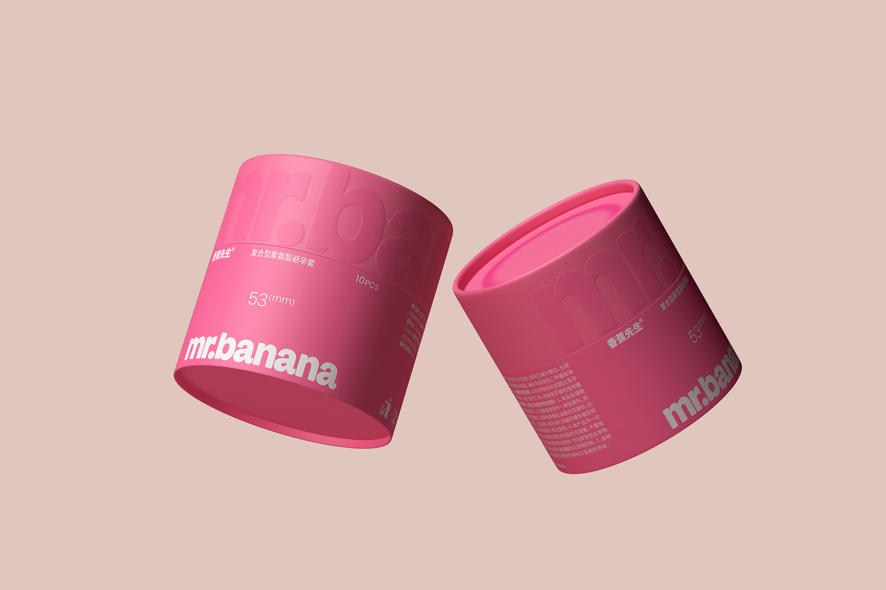
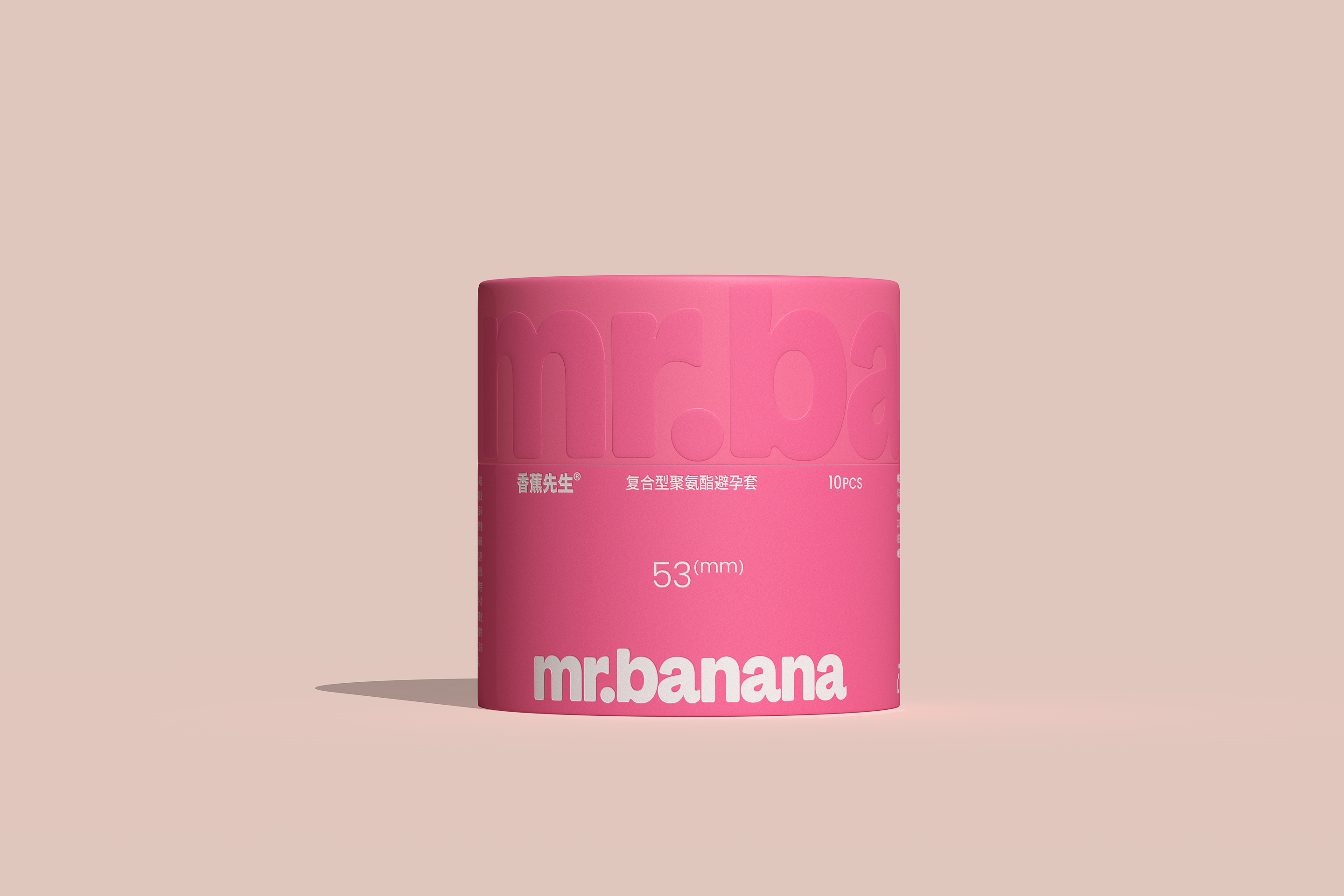
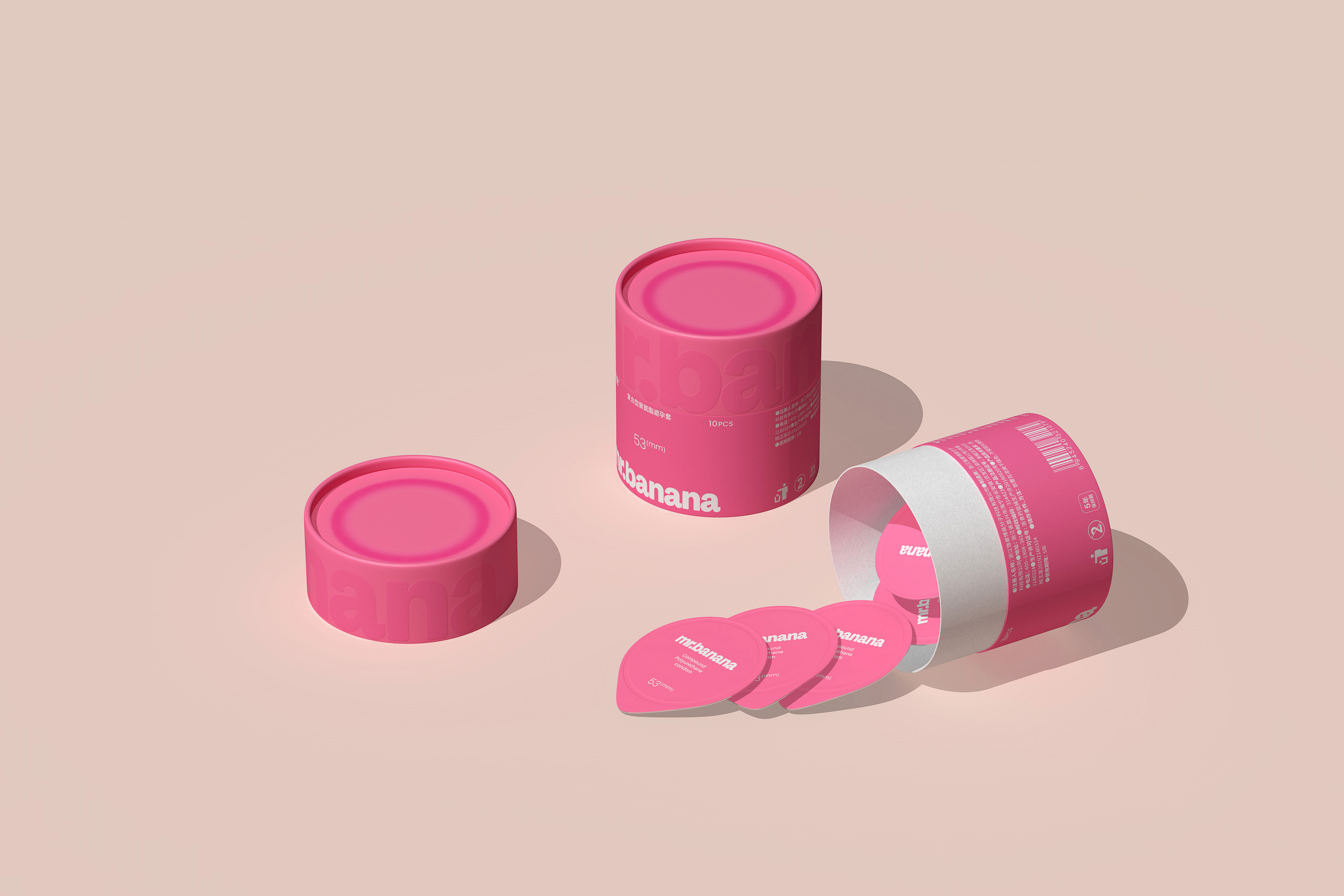
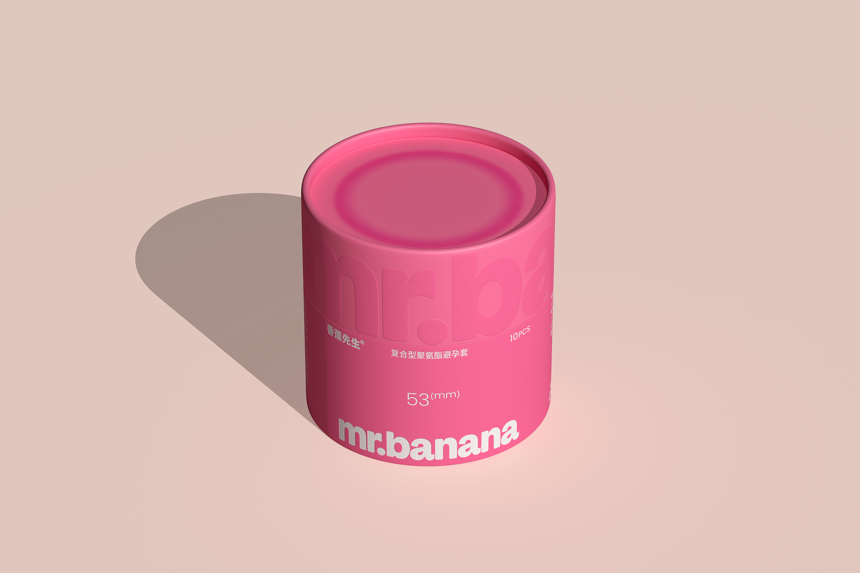
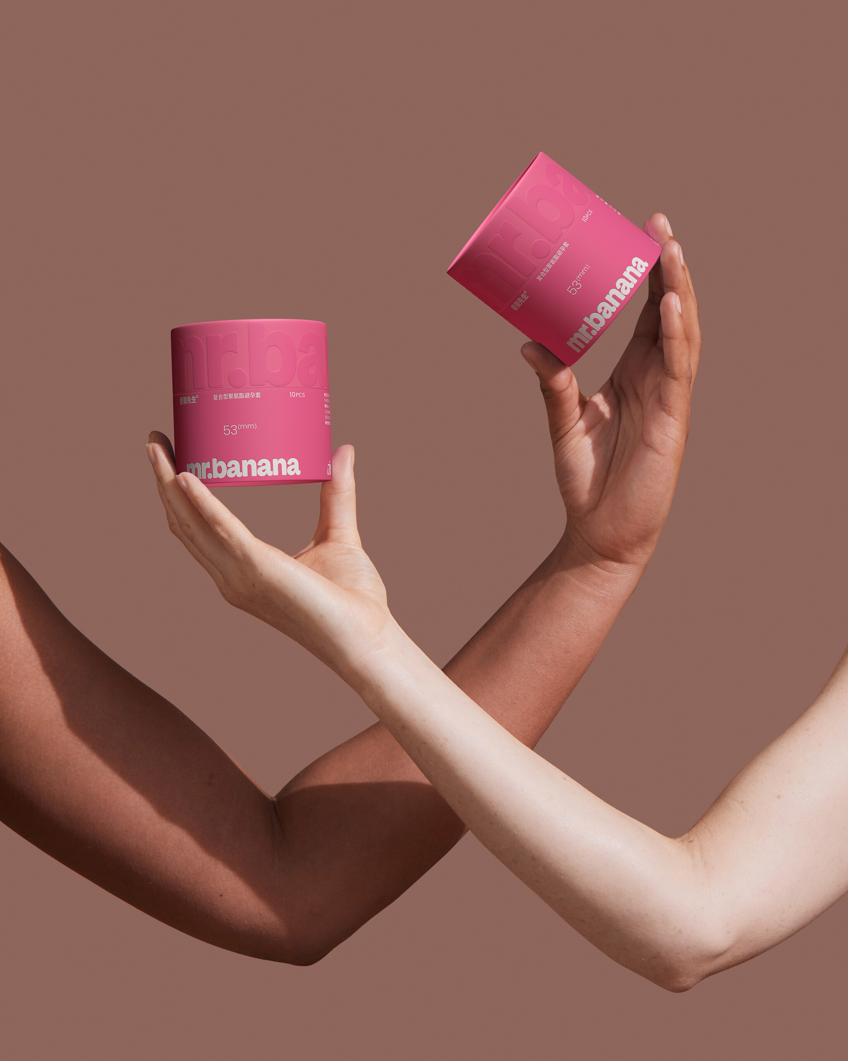
为香蕉先生设计的全新中英文标志及主款避孕套安全套产品包装。
香蕉先生logo及包装设计升级获得了:behance,Dieline,pentawards多个设计平台推荐和报道。
来看看他们分别对此作品的解读以下
来自的pentawards解读:
更新后的标识从旧的卡通标志转变为新的文字标志,增添了时尚和现代的气息。定制的衬线字体以其生动的反弹和紧凑的字符排列,与精致的粉红色和白色配色方案相搭配,营造出一种诱人而亲密的感觉。
来自Dieline的解读:
张韬设计为中国安全套品牌香蕉先生重新设计了时尚、直观的安全套包装,为安全套包装带来了巨大的升级。虽然他们最初的标志采用了过时的卡通外观,但新的文字标记给品牌带来了时尚、潮流的感觉,仍然充满活力和乐趣。
定制的衬线字体有很好的反弹效果,字符紧密地排列在一起,看起来很亲密,适合避孕套公司。这些盒子特别酷,有罂粟花般精致的粉红色和白色设计,保留了该品牌最初的俏皮感,同时赋予了它们一种值得炫耀的成熟感。
The updated identity moves away from the old, cartoonish logo to a new wordmark that adds a stylish and modern flair. The custom serif typeface, with its lively bounce and tightly packed characters, is paired with a sophisticated pink and white colour scheme to create an inviting and intimate feel.
Zhangtao Design gave condom packaging a huge upgrade with their sleek, intuitive redesign for the Chinese condom brand Mr. Banana. While their original logo leaned on a dated, cartoony look, the new wordmark gives the brand a stylish, on-trend feel that’s still buoyant and fun.
The custom serif has a nice bounce to it, with the characters packed close together for an intimate look fitting for a condom company. The boxes are especially cool, with a poppy, yet sophisticated pink and white design that retains the brand’s originally playful feel while lending them a maturity that’s worth showing off.
扫描二维码分享到微信